Components and Varibles
When designing for Guardian Angel, I focused on structuring files and components in a way that would be universally understandable and valuable for any collaborator—whether they’re a developer, a designer, or another stakeholder. This approach not only ensures a smooth workflow but also allows for easy scalability and adaptability as the project evolves.
Components
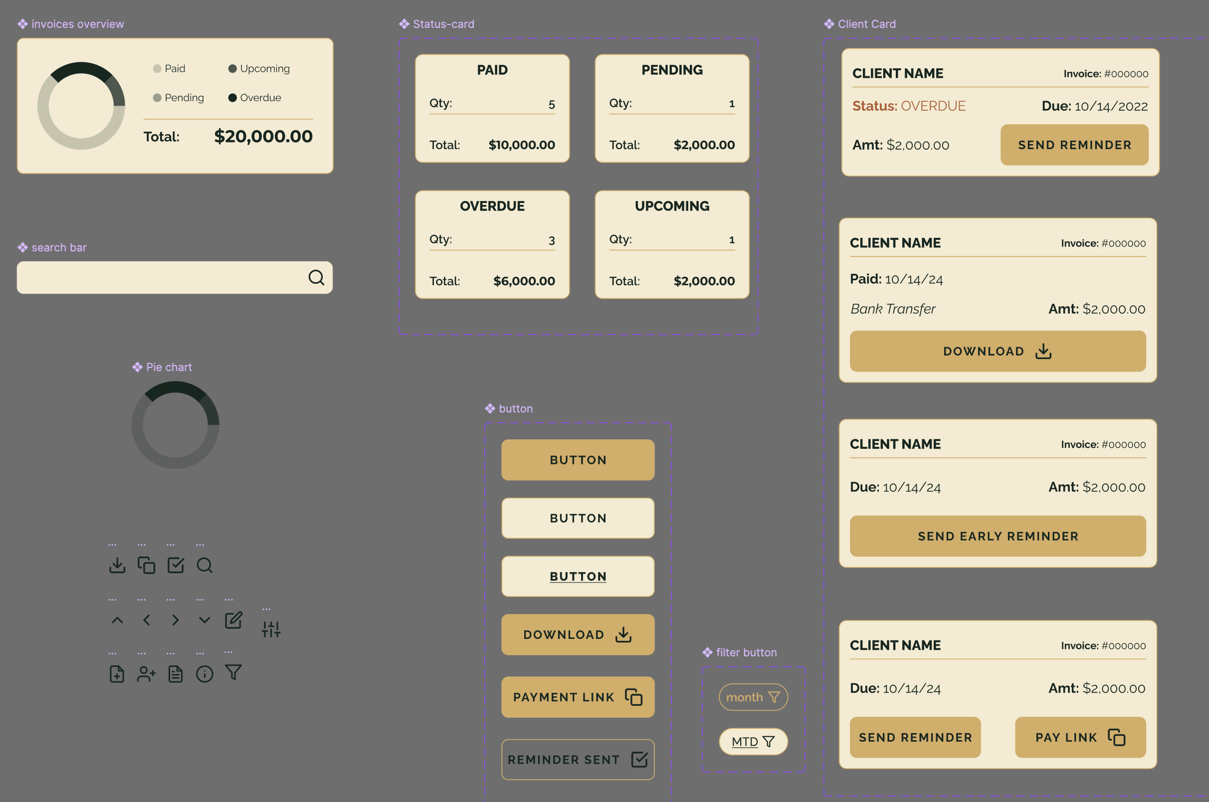
Each element, from buttons to invoice cards, was created as a reusable component. This modular approach makes updates seamless: a change to a component is automatically reflected across the entire app, saving time and ensuring consistency. This setup is especially useful for developers, who can easily reference and apply design elements in code, reducing potential errors and streamlining implementation.
Variables
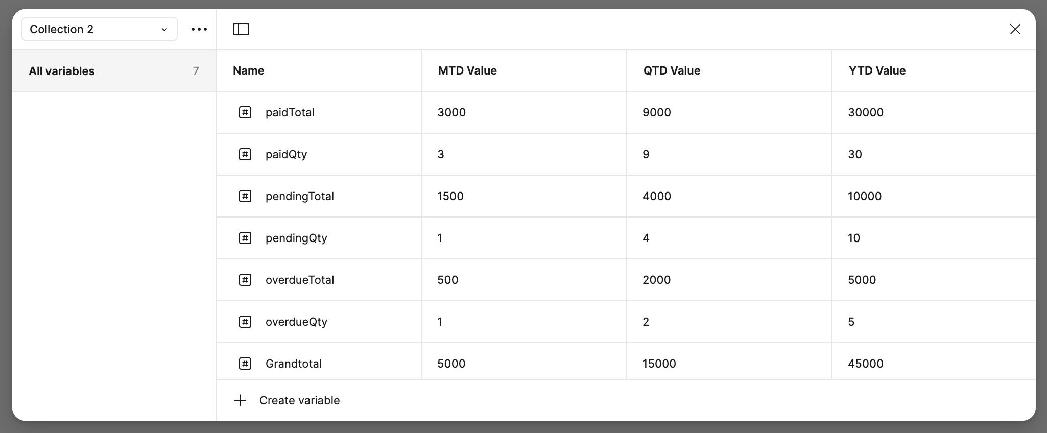
I used variables extensively to maintain consistent styling, particularly for color schemes, typography, and spacing. This allows for effortless theme adjustments without manually updating individual components. For instance, changing a single color variable updates every instance where that color is used. It’s an efficient way to keep the design adaptable and to quickly make visual changes, which is essential for long-term projects.
By organizing files thoughtfully, I aim to create a workspace where every component and variable is intuitive and easily accessible. This structure supports effective collaboration, reduces redundancy, and helps ensure that design intentions are preserved from concept through development.


