Expedite DDS
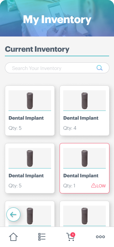
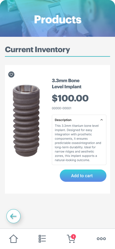
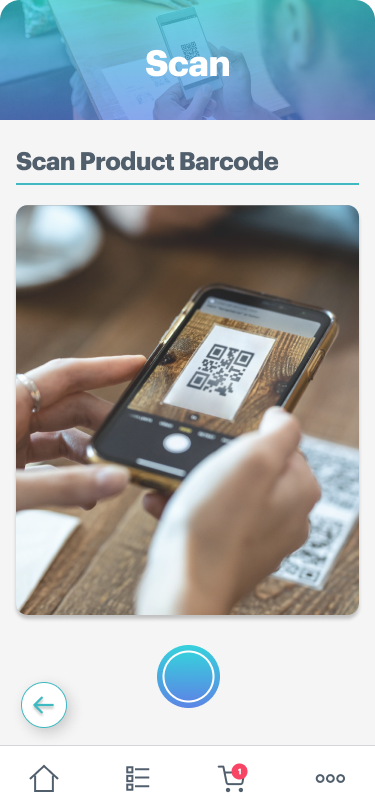
I designed the Expedite DDS app with a soft color palette, rounded fonts, and plenty of white space to create a calm and approachable experience for dental staff. My goal was to make the layout clear and the icons intuitive, reducing cognitive load and making it easy to navigate and manage tasks. I also included subtle visual cues, like the “LOW” indicator, to highlight important actions without overwhelming the user. Altogether, these design choices make the interface user-friendly, stress-free, and professional, which is perfect for managing inventory efficiently in a dental setting.


DMOS UI
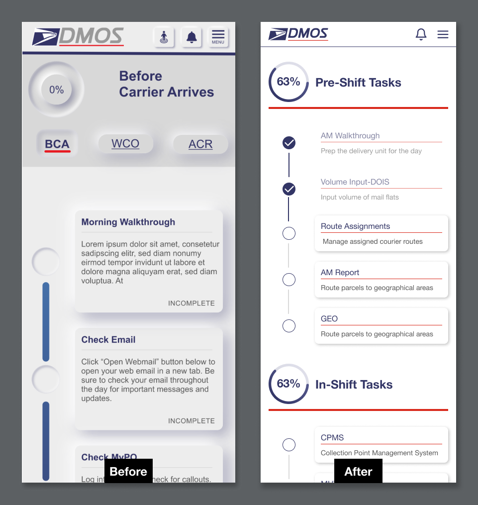
This close-up of the DMOS Case Study UI shows how I streamlined the Delivery Unit Supervisors’ workflow. Tasks are organized in chronological order, consolidating what was previously scattered across multiple screens and URLs into a single, cohesive interface. This design simplifies navigation and helps supervisors efficiently manage their pre-, in-, and post-shift tasks in one place.


